Colour is a transformative medium, the colour of a room is often one of the first elements you notice but often one of the last to be considered or implemented.
The perception of colour can have a dramatic effect depending on the environment it is implemented in. Choosing a wall colour can often be the deciding factor In creating a successful scheme for your interior.

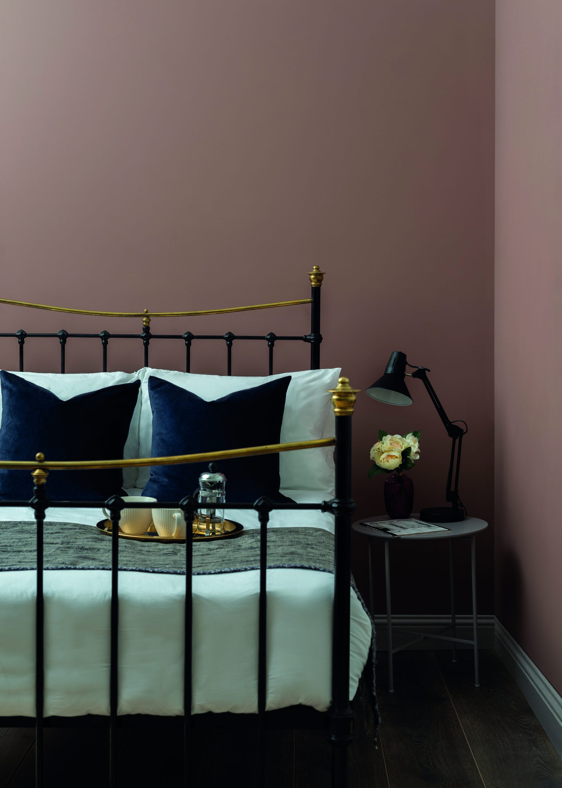
Image: Colourtrend Paints
Styling: Ger Cooney Design
The swiftest way to implement colour is to of course paint the walls.
Considerations should be made for the finish of the paint, Matt, soft sheen etc.
Deciding factors are the condition of the surface and the usage of the room, bathrooms, kitchens etc.
Walls which have blemishes or imperfections are better suited to an interior Matt finish as it is more forgiving. Soft sheen highlights any imperfections on the surface and also reflects more light which can alter the appearance of the chosen colour.
When choosing a colour palette it is important to consider how the room will be used, evening rooms for instance tend to work better with richer colour palettes to create a warm and cosy atmosphere.
Before applying paint it is important to test the colour in the room, this can be achieved in a number of ways. Tester pots are a big favourite as you can dab the colour on multiple walls and see the colour for yourself. Bear in mind the appearance of colour will vary compared to the colour card. The reason for this is because the swatch of colour on the card is quite small, typically the size of a stamp. In reality on a larger scale the colour will take on a different appearance. In general terms the colour will appear lighter or less intense than its counterpart on the colour card. This is true in most cases regardless of the brand you are purchasing. Be aware also that with some companies the brochures show a printed representation of the colour rather than an accurate paint swatch on a smaller scale.

Image: Ger Cooney Design
An alternative is the colour swatch card, there are a number of companies that offer these which prove very effective. There is no mess, they can be brought to furniture and lighting showrooms if you want to test against other products. They also offer a swifter solution to choosing colour and are ultimately less expensive. If you prefer to paint swatches on the wall I would suggest buying a roll of lining paper and use that as your canvas for testing. You can paint larger swatches which can be tacked to the wall so you can make an informed choice. Your decorator will also appreciate it as there will be less preparation and ultimately cost. So it is a win-win situation.
The appearance of colour will ultimately depend on light and the surface it is painted on and the time of day. East facing rooms will have more light in the morning whereas West facing rooms will have a greater share of light in late afternoons and early evenings. North facing light is quite cool and not very bright, whereas the optimum aspect is South facing as it gains light throughout the day.
Colour preference is of course subjective but by following a few simple guides points above can gain the most out of your new scheme.