My newly built house is painted white – I would love to embrace colour but am afraid of getting it wrong! Can you offer some tips on how to choose stronger wall paint colours?
Ger Cooney, Interior Architect & Designer at Ger Cooney Design advises…
Many of us like to be a shade braver when it comes to colour (pun intended) when considering colour for your home. Particularly if it is a departure from more neutral options or a blank canvas and there are some key aspects to consider.
The best place to start is with your high ticket purchases such as flooring and furniture. These items will not only set the scene in terms of style choices but also the colour palette not just at the start but also down the line.
Consider how and when the rooms will be used, for example a bedroom is an ideal place to select deeper colours as they are used primarily in the evening.
Testing of colour is vital and in regard to new builds this very important indeed as this could also set the direction of your interiors for the next several years. The orientation of the spaces and the amount of natural light available is also important.
Light, both natural and artificial will impact how the colour as viewed as well as times of the day and times of the year.
If you wish to ease yourself gently into creating a deeper colour palette, try a smaller space and build from there. Bedrooms or W.C’s are a good place to experiment as typically these spaces are not as prominent as the main spaces like kitchens, living rooms & hallways.
When testing colour the larger the swatch the better, when colours are displayed on colour cards the appearance will always appear stronger. This is down to the scale of the sample which has a stronger concentration visually to the naked eye and especially against a bright white backdrop. It is when you see the colour on a larger space that your eyes can adjust and see a truer reflection of the colour. To get an impression on a larger scale without peppering the walls with testers, you could paint tester pots on lining paper. Seeing the colour on a larger surface area will give a clear impression and help you acclimatise to the look.

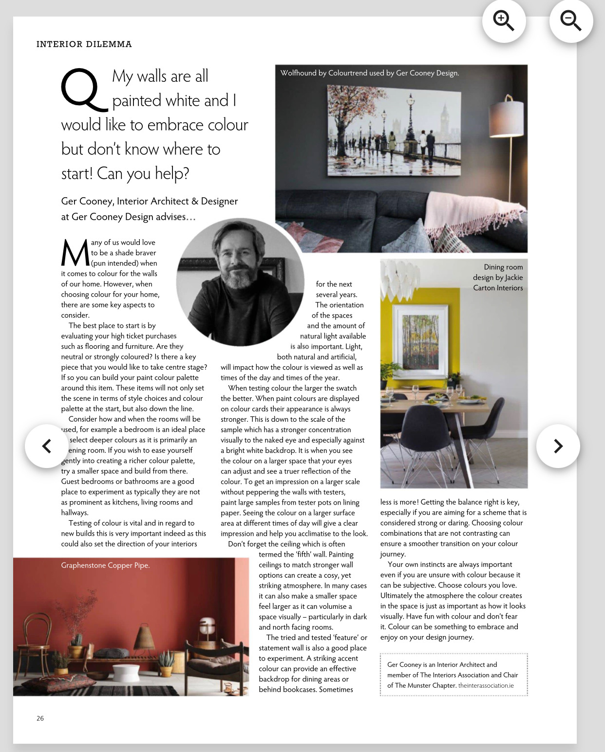
Image & Design: Ger Cooney Design
Don’t forget the ceilings which is often termed the “fifth” wall. Painting ceilings to match stronger wall options can create a cosy, yet striking atmosphere. In many cases it can also make a smaller space feel larger and cavernous as it can volumise a space visually. Particularly in dark and North facing rooms.
The tried and tested “feature” or statement wall as I prefer to call it is also a good starting place. This can provide an effective backdrop for dining areas or behind bookcases. Getting the balance right is key, especially if you are aiming for a scheme that is considered strong or daring. Choosing colour combinations that are not contrasting can ensure a smoother transition on your colour journey.
Your own instincts are always important even if you are unsure with colour because it can be subjective. Ultimately the atmosphere the colour creates in the space l is just as important as how it looks visually. With these few points colour can be something to embrace and enjoy on your design journey.
Ger Cooney is an Interior Architect and member of The Interiors Association and Chair of The Munster Chapter
www.gercooneydesign.com Instagram @gercooneydesign